Case study / Product Design
Resale, reworked
Updating Troquer’s mobile experience with its new brand.
INPUT ACCESSIBILITY · 5 MIN READ
A mobile redesign that grew into a fuller, more reliable system to help users deal with uncertainty.
Troquer is a pre-owned luxury resale app that needed to show off its new brand. My job was to improve the whole experience, not just the screens but also the steps between them. I updated the seller valuation flow to be honest about uncertainty and created a flexible card system. Some of these patterns later became the foundation for the web experience.
Context Overview
Troquer sells pre-owned luxury items, so trust is essential. When the company launched a new brand, it needed the mobile app to show that change.
The client already had an earlier version of the app built from earlier research, implementations, and UI. But the brand then had a new image. As I reviewed this version of the app, I saw the main problem was that the screens were there, but the steps linking them were missing. The experience did not include progress updates, feedback, fixes, or ways to handle uncertainty.
This was especially clear in the seller valuation process. Users had to answer nine questions before getting an estimate, and even then, the estimate still needed an in-person check.
Defining the problem
We need to complete the whole experience, not just add missing screens but also improve how users interact, get help, and move through the process.
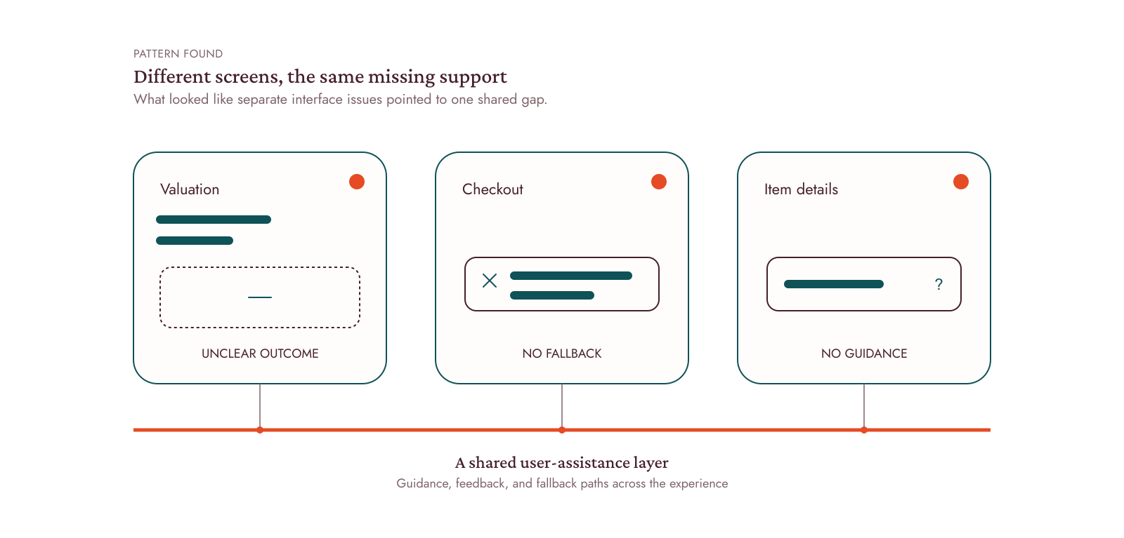
When I mapped out the buying, checkout, and seller valuation steps, I saw the same problem. Whenever the system could not give a final answer, it stopped communicating with the user.
The seller valuation flow became the main focus of the project because it had the most uncertainty and required the most trust.
Constraints
Troquer could not confirm an item's value until a specialist checked it. The app could only give an estimate, so we needed to show uncertainty in the experience instead of hiding it.
This flow consisted of:
- Show a price range instead of a single value.
- Replace dead ends with clear fallback paths.
- Keep the original purchase price optional to avoid excluding sellers.
Approach
Instead of designing the flow based on the data setup, I based it on the conversations that happened in Troquer's physical stores.
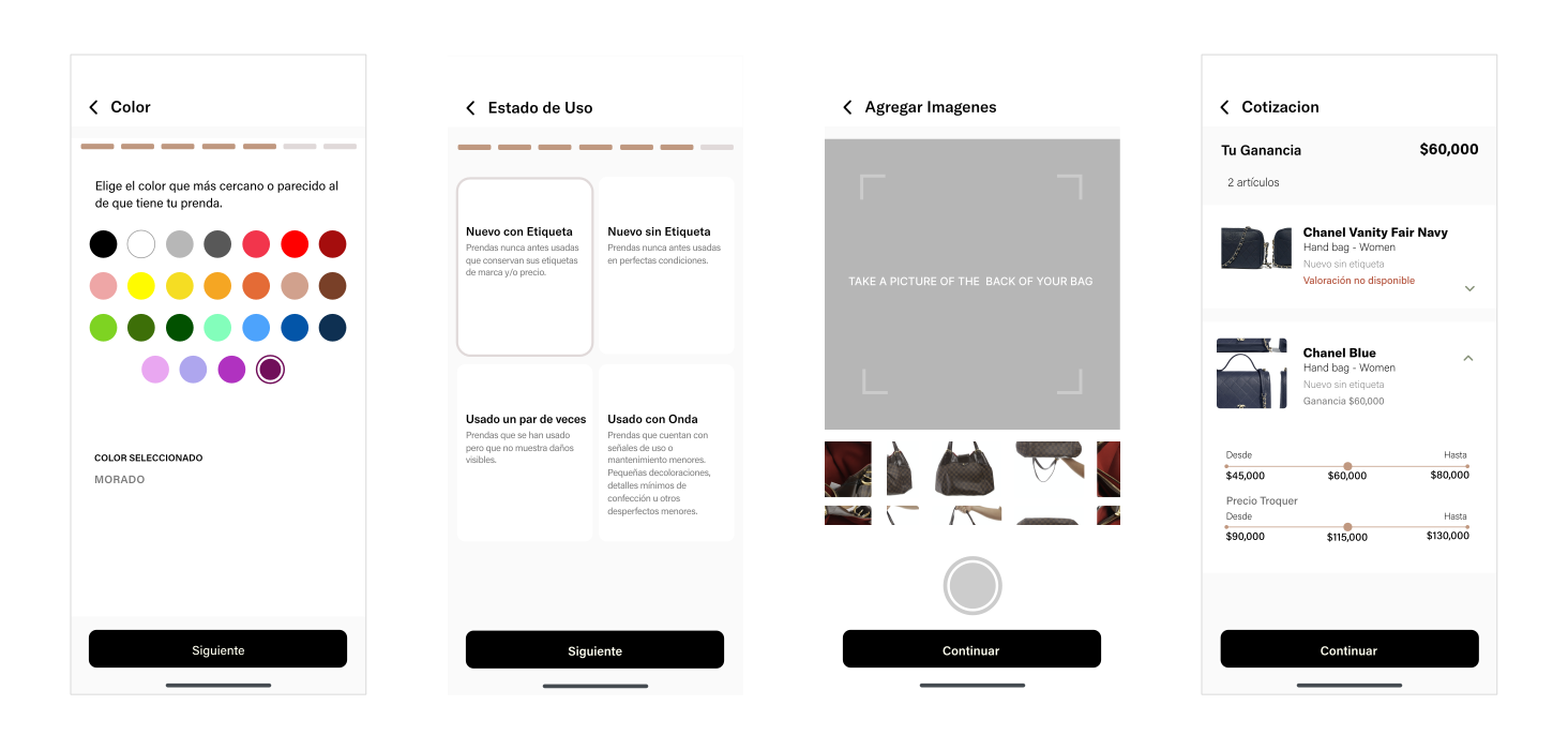
I used Troquer's in-store valuation conversation as the structure for the flow. Four principles guided the experience:
ONE DECISION PER SCREEN
Each step focused on one question, making the process easier to follow and less tiring.
VISIBLE PROGRESS (FEEDBACK)
Sellers could understand how far they had come and how much information was still needed.
REVIEW BEFORE SUBMISSION
A summary gave users the chance to confirm and edit their answers before requesting an estimate.
GUIDED PHOTOGRAPHY
The app asked for specific views one at a time, using labels and framing tips based on what specialists needed to see.
I used the same approach for browsing. Instead of making different product cards for each case, I designed a flexible card system that could change to show discounts, showroom availability, sold items, and selected closets.
Accessibility
When I reviewed the new brand, I found another problem. Some parts of the interface no longer had enough contrast to be accessible.
Instead of fixing each screen one by one, I updated all the affected parts at once by:
- Increasing contrast across disabled and secondary states.
- Adding text labels alongside color swatches.
- Reviewing similar patterns throughout the app.
This was one of the first projects where I started treating accessibility as part of the design process, not just something to check at the end.
Outcome
The app stayed in use for about three years before the company switched its focus to the web experience.
Even more important, several UX patterns lasted beyond the mobile app. The seller valuation process, product card system, and interaction states became the base for the web store and mobile web experience.
| Valuation flow — seller side | Valuation flow guided step by step |
| Item card system | Flipping card mechanism to display different item data |
| Interaction design | Complete feedback states across key user journeys |
Reflection
Communicate the design thinking behind the solution. First, I focused on making the screens work and look adequate, but I did not always explain why it worked. Today, I would connect each decision to the user need, business context, and broader experience before even jumping to the file.
Recognize the pattern earlier. I treated guidance, empty states, and fallback messages as separate screen problems. Looking back, they were all part of the same user-assistance system.
Key takeaway
This project taught me that we can't always join at the start of a project or early stages. There's value in using what already exists: research, business knowledge, and the current experience. Understanding those basics helped me improve the process without starting over.
It also improved my ability to listen, negotiate, and design patterns that could change as the brand and needs changed, and work with a bigger team.
Analyze before replacing, collaborate before deciding, and design for change.