REDWOOD DESIGN SYSTEM · ORACLE
Not just a bug
Identifying the common system issue behind a growing list of accessibility problems.
INPUT AND FORMS ACCESSIBILITY

Context Overview
From November 2024 through March 2025, my colleague and I, both Senior UX Designers on Redwood's Interaction Design team, led work on more than 10 accessibility issues across the Forms, Inputs, and help features. We worked closely with Visual Design, the Accessibility team, Product Managers, and Engineering.
The problems arose from several sources, including engineering alerts that identified accessibility failures, customer complaints, and internal reviews. These pointed to a pattern that was not yet fully mapped. More importantly, they mattered: Redwood's user base includes companies in regulated industries, so accessibility compliance is legally required.
The frame
User Assistance is how Redwood gives field-level guidance and feedback. It includes placeholder text, hint text, required indicators, assistive text, and validation messages.
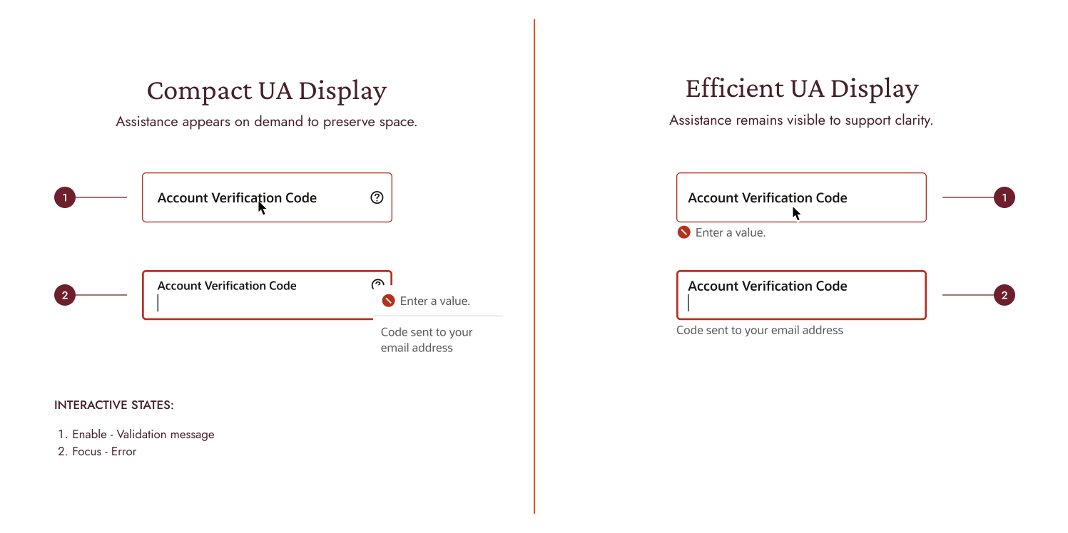
Redwood offered two methods for displaying this information:
- Efficient User Assistance Display kept the guidance in view.
- Compact User Assistance Display showed it only when the user interacted.
Both methods were available because they solved space-related problems, and teams could switch displays when components needed to be denser.
Forms normally used Efficient UA Display, and teams had the option to enable Compact UA Display in forms and use it in editable table cells when space was limited, even though the available documentation was scant.
The problem
The ten or more accessibility problems had different outward appearances but shared the same origins.
Compact UA Display in forms created friction at every level.
- Required indicators appeared as asterisks with tooltips. But we couldn't assume users understood asterisks or knew to hover over them.
- Icon-based approaches relied on labels that could be truncated.
- Assistive text required extra keyboard steps to reach.
- And when validation messages piled up with other guidance, screen readers announced so much at once that users lost track of what mattered.
- The long labels at the top and at the beginning positions were being completely truncated, which made the fields unreadable.
The effect was more than just "annoying". Since Redwood is used by companies subject to regulation, failures can create customer complaints and liability. This was not a series of individual bugs; it was a system-level problem.
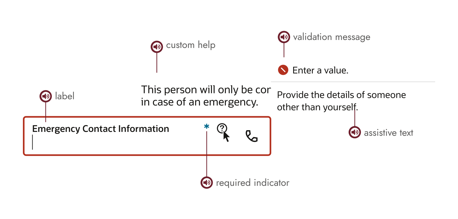
Screen reader behavior was inconsistent. Different components announced guidance differently.
Mapping the decision space
What seemed simple at first
The simplest thing I could start exploring was turning off the inside labels when Compact UA Display was on, since that would remove the truncation and thus eliminate the problem.
However, when I discussed it with my manager, we realized something important: removing a configuration that products already depended on could put existing users and customers at risk, even if the configuration appeared broken. Therefore, we needed to find out what was actually relying on it before removing any part.
My colleague and I needed to understand what should happen, not just what was broken.
The turning point: accessibility workshop
A few weeks later, after we had provided a quick fix for the most critical problems, we took part in a workshop organized by our Accessibility team. That was the point where the issue shifted from individual fixes to overall design and behavior.
They showed us how screen readers should announce the various fields. What order should we follow for the label, the required indicator, the field, the hint, and the error message? How should I handle a label that got cut off visually but still needed to be read in full? What roles and ARIA attributes made this work?
The resulting guidelines focused on reducing noise and timing. When using the keyboard, omit unnecessary announcements. Indicate errors only when they are relevant, and allow error messages to disappear as soon as the input becomes valid. The principle was simple: provide feedback only when it is important, not earlier.
It wasn't merely theoretical; these patterns formed the basis for everything that followed. At that point, we had a clear guide to what 'correct' should look like in different situations.
Audit: seeing the real picture
With that framework, I audited approximately fifteen input types. Text, number, password, address, phone, textarea, and more. For each, I tested the worst-case scenarios: inputs with +/- buttons, prefixes and suffixes, long labels, and multiple validation states happening simultaneously.
In total, I stress-tested around twenty configurations.
The pattern was obvious. Compact UA Display created chaos in forms. Validation messages, hints, feedback. Everything piled up in popups, covering what users actually needed to see. Forms are complicated. People move through multiple fields, each generating different feedback. That feedback needs to stay visible, not disappear behind interactions.
Table cells are different: you work on one cell at a time, and the feedback you receive is simpler. Since you're not managing multiple interactions in parallel, on-demand guidance is appropriate, and Compact UA Display fits this situation. Almost necessary.
Compact UA Display solved a real problem, but only for certain contexts. Forms and grids needed different rules.
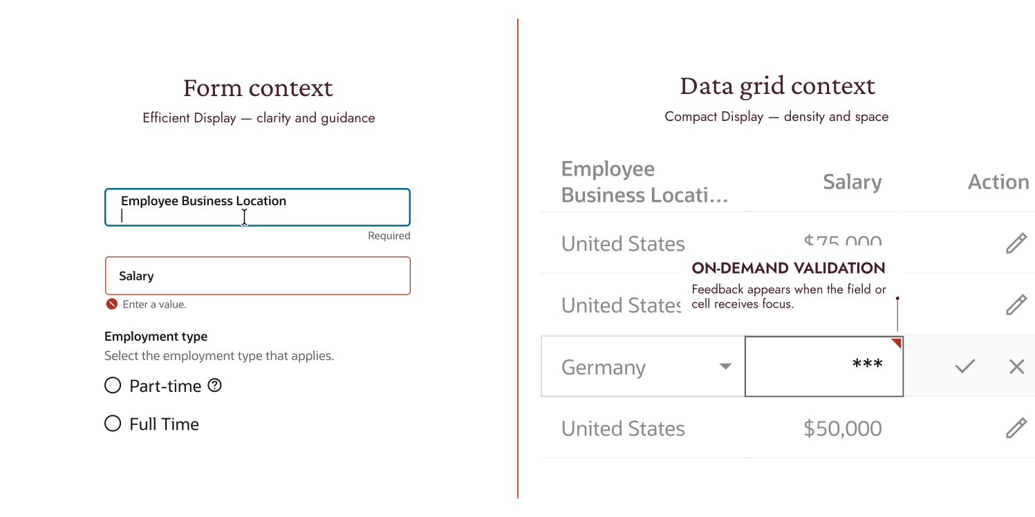
THE SAME INPUT BEHAVIOR. TWO COMPLETELY DIFFERENT OUTCOMES DEPENDING ON CONTEXT.
The architectural decision
Once we had that clarity, the path forward became obvious. Though we still needed to discuss it and get approval.
We completely removed Compact UA Display from forms.
Careful communication was required. It involved informing the teams that the configuration they were using had to be altered. However, the data supported this view. After asking the Engineering team to review usage, they discovered that Compact UA Display in forms appeared in fewer than 1% of codebases. Those edge cases could solve their space problem using Compact Density instead.
The other members of the team readily agreed with this approach since it was good architectural design, remained backward-compatible in the areas that counted, and provided us with a direct route ahead for the next generation of components.
What we built
Label overflow behavior
Labels within the interface are truncated at a specific breakpoint, with the full text appearing when the user hovers over or focuses on them. Screen readers also have access to the complete label. The top and start labels wrap so that the entire text remains visible. This is a simple rule applied consistently throughout.
Inside labels

Truncate at the breakpoint; reveal on hover or focus.
Top labels
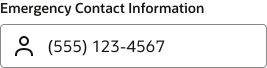
Wrap to multiple lines to keep the full label visible.
Start labels

Wrap to multiple lines to keep the full label visible.
Updated documentation
When the Engineering team analyzed usage, they found Compact UA Display in fewer than 1% of codebases. That data gave us confidence to remove it from the next generation officially. We included the reasons for this decision in our documentation. We prepared specifications that clearly outline when to use Efficient UA instead of Compact UA Display and when Compact Density is appropriate.
Internal accessibility workshop
I was later invited to serve as a panelist for Oracle's accessibility initiative to discuss how to document accessibility in design work. I shared the template and approach, showing how to integrate accessibility documentation not just in final specs but throughout design reviews, explorations, and presentations.
The message was clear: consider access from the start, not as a final check.
What changed
We settled three closely related problems: label truncation and accessibility, inconsistencies in screen reader announcements, and confusion about when to use display settings. Together, they showed that the issue was architectural rather than isolated.
The patterns thus obtained applied to both generations of the component library. The rules for Forms became clearer. Grids received a formally defined display pattern for the first time, and future components were based on a documented model built on the patterns we had discovered rather than on the constraints we had inherited.
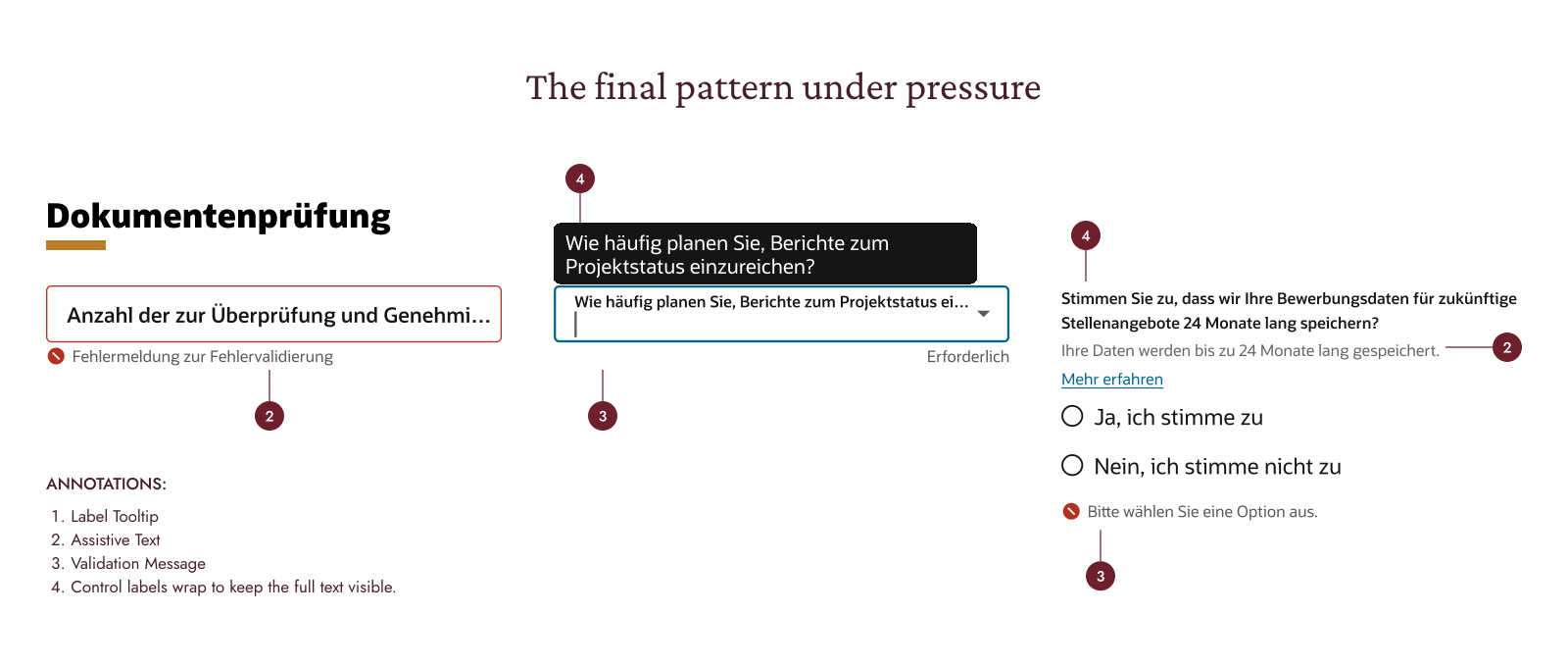
THE PATTERN UNDER REAL-WORLD PRESSURE: TRANSLATIONS, TRUNCATIONS, MULTIPLE FEEDBACK TYPES.
The choice to separate display settings by context was not a compromise. It demonstrated that consistency in a design system arises from shared intent, not from identical behavior. Since forms and grids have different objectives, they require different rules.
What I'd do differently
I should have consulted the Accessibility team at an earlier stage and obtained usage data before arriving at a design solution, since that figure of less than 1% would have affected our timetable. More significantly, the workshop insights shaped everything we did. If we'd had that framework from the start, we would have audited faster and established the direction more quickly.
The real gain wasn't in how quickly learning could happen. It was in recognizing when a problem appears to be a bug but is in fact an architectural issue. It's not that the truncated label is the problem; the question is whether this context requires guidance that is visible or available on demand. After you pose that question, the solution comes almost automatically
A small bug can point to a major system decision.
And maintaining a design system isn't only about fixing what breaks. It's about understanding why it broke, who already depends on the broken behavior, and whether the same rule should continue into what comes next.