Case study / Design systems
Enforce or enable?
How much accessibility should a design system take responsibility for?
INPUT ACCESSIBILITY · 5 MIN READ

Input Rich Text was evolving beyond basic formatting. New requests included font color, font background color, and richer editing capabilities. Rather than designing a single solution, we explored multiple levels of accessibility support that balanced flexibility, usability, engineering effort, and long-term scalability.
Context Overview
Input Rich Text already lets users pick font and background colors from a set list. This worked for an earlier, quick-turnaround need, but as more teams used it, we saw the experience needed to improve.
Teams wanted a more flexible Redwood pattern that could handle a wider range of colors, custom values, and future features like transparency. But adding this flexibility raised new accessibility questions I hadn't faced before.
Finding the real problem
Like it commonly does in the design system, a simple color-picker improvement made visible a bigger question for the team:
How much responsibility should the design system take for helping product teams create accessible content?
I researched how other editors balance this. I looked at Microsoft Word, Notion, CKEditor, and TinyMCE to see how they handle experience, adaptability, and accessibility. There wasn't one clear standard. Some editors limited color choices, while others gave more freedom but offered guidance or checks. The main question was where Redwood should fit on that range.
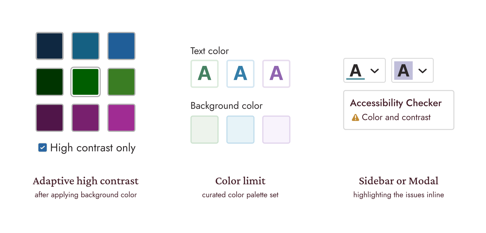
Mapping the decision space
Color formatting affects two types of users, and they’re usually not the same person.
COMPOSING
The person choosing the color is rarely the one who has to read it.
READING
The reader needs content that is clear and accessible.
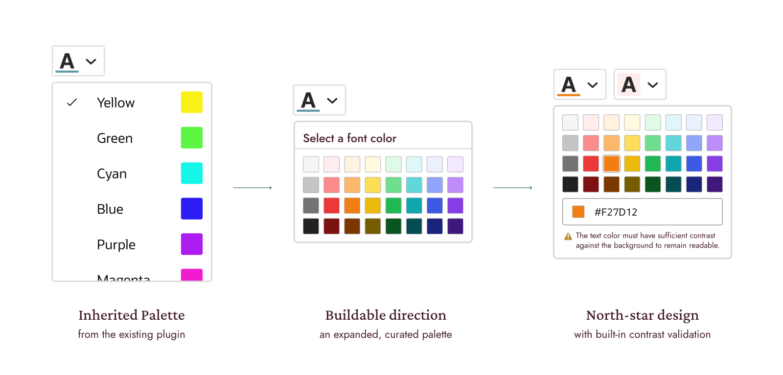
Each level was a different effort that has pros and cons; knowing the north star design possibilities created a clear path to more advanced customization.
Choosing a direction
I evaluated two approaches: add both a selected palette and an input text for custom colors right away to cover more uses, which would put most of the accessibility responsibility on product teams. Instead, I recommended introducing changes step by step. Starting with a selected palette would improve things right away, and we could add more customization as we improved accessibility support.
My main principle was: accessibility is the default without taking away flexibility from teams that need it.
A scalable roadmap
| Level | EFFORT |
|---|---|
| 1 · Foundational guidance | Provide written guidelines only. No UI or logic changes |
| 2 · Curated palette | Independent palettes with validated contrast |
| 3 · Informative feedback | Show assistive text, but don’t prevent input. |
| 4 · Smart color picker | Add real-time validation to the color picker and HEX input. |
| 5 · Full-context validation | Validate color contrast within the actual IRT content. |
Each level was a different effort with pros and cons; knowing the north star design possibilities created a clear path to more advanced customization. I kept the design buildable with what we already had: a predefined but more complete color palette, including interaction states, keyboard navigation, focus behavior, and screen reader support. The team delayed custom values until we could support them responsibly and accessibly.
Outcome
I led the alignment with the Accessibility team and presented the phased approach to Leadership. With their guidance and support, they agreed to start with foundational guidance (only guidelines) and a curated palette.
This let Input Rich Text go beyond the old vertical list, but without adding full customization before we had a strong accessibility plan. The other levels became a clear plan for future color support, feedback, and checks. The visual designer on the project then translated this roadmap into the component visuals.
Reflection
How much responsibility should a design system take for accessibility? The answer was not about finding the responsible parties, but about understanding the users and the use cases. Through this project, I learned that providing enhancements keeps the systems updated, reliable, and useful, and it should be flexible and user-centered. Although we can't deliver the full list of requirements with each upgrade, I now publish with the certainty that it will be accessible and accountable, because I care and know the importance of considering all types of users.
Key takeaway
Every design system update sets a direction, even if it starts as a small request. And every component, composite, and page template adds to provide a reliable experience.
This project changed my perspective of how color is used in interaction design.
More flexibility can create better expression, but it also asks us to be more intentional about accessibility.